Of course, I (quite clearly) do not own this property, nor am I an elected official, so my input on what happens there is minimal (if it exists at all). Nonetheless I recognize that the Speedway Redevelopment Commission will sooner or later have to tackle this property and, as such, I have a few suggestions.
First, let's recognize that the Speedway Super Center will not ever look like Main Street. It was originally built in a different era, for different needs. Main Street was designed to be just that: a main street, where commercial activity could be centrally located for those who lived in the immediate vicinity. The Speedway Super Center, on the other hand, was designed to be a shopping center to which people would drive from many miles. If you ask me what the best-case scenario of the Speedway Super Center is, post-redevelopment, I would point to Clay Terrace in Carmel or Metropolis in Plainfield.
These endpoint goals are for another day, though, because I just want to discuss traffic. Here is an aerial view of the area I'm referencing:
 |
| Aerial view of Speedway Super Center. 25th Street, more or less, runs across the top; Lynhurst is on the right, and you can't see H.S. Rd. on the left. |
1. The parking design is really terrible.
Here is what I'm talking about:
Notice that this is essentially the main artery going East/West through the north end of this shopping center. It is important for traffic to move freely through there, yet it is designed to require pedestrians to cross the artery.
Another view of the same general area:
This is a bit further down. Note that one can't get to the nearest grocery store without driving along this route; again, it's not thoughtfully designed.
It doesn't have to be this way. Some thoughtful redesign of this parking/traversing area would vastly improve the experience there.
Below is a picture of one random portion of Clay Terrace:
Note that there is parking along the building, and the degree to which that seems to change the character of both the walkways and the driving lanes.
The "traffic" through the mall is less obstructed, parking is easier, and the walkways are friendlier. In fact, we have already deployed this tactic in Speedway:
So, my point as to the parking and the layout of the Speedway Super Center is that the buildings themselves don't need to be rebuilt. I am agnostic as to their condition, but I believe that their location lends itself just fine to some redesign that would make the area considerably nicer.
2. The streets are poorly designed.
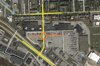
The thoroughfares of the area should cross at different points. Again, here is an aerial view of what I'm talking about.
You can see that I've superimposed on the area where the major intersections are. I think that the middle one, especially, needs work.
Imagine for a moment if the traffic flowed through the area like this:
You can see, in orange, where I've superimposed a roundabout within the existing area. The part of Parkwood Dr. that goes through the shopping center would be transformed by a roundabout, further south. This would enable more of the curbside parking discussed in point #1 above, and would render this thruway considerably more pedestrian friendly.
3. Green Space Helps
I note that nearly every place in the world worth being has something growing there; perhaps the plants and trees know something we don't. Anyway, given that the parking lots there are, quite literally, never full, wouldn't it be worth it to put some green space in there? Some place where the citizens of Speedway could enjoy a cup of coffee and a book, or perhaps simply read the newspaper or have lunch? Green space makes everywhere better,even the Speedway Super Center.
So there it is; three things that could be done on the "reasonably" cheap that would make a world of difference for the Speedway Super Center. I have heard that the property owner is a pretty good corporate citizen; I see that they've dumped a bunch of money into the eastern portion of this development.
Here's to hoping for the best!


No comments:
Post a Comment